Tuesday, July 15, 2014

A Day at the Museum of Modern Art

 This past Sunday Biff (Janet Baskerville) and I decided to head off to the City. We researched current exhibits in all the museums and opted for MOMA. I think it's because we were both craving some excitement and color... and we found it. There are no words for the feeling when you're standing in front of one of the paintings that you've seen pictures of for years and now it's right there... right in front of you! Below are some examples of what we saw. Please forgive some of the images as some of the paintings were protected by glass and it was hard to avoid the reflections. I hope you'll enjoy the day through our eyes.

Best... Canace

Arriving at Grand Central Station

Grand Central

MOMA   


So thrilled to find Joseph Cornell's work... assemblage is my first love.
Joseph Cornell

Joseph Cornell

Joseph Cornell

Joseph Cornell
 This painting by Matta took my breath away. His ability to convey light and dimension should definitely be seen in person.
Roberto Matta

Dorothea Tanning

I have to admit that until I saw Pollock's work in person I didn't 'get it' but now I do. I would guess that this painting was about 9' high and 18' wide.. full of energy.
Jackson Pollock

Robert Rauschenberg

Andy Warhol
 When you first see this it appears to be a giant spooky tree. As you get closer you can see all the little children. The detail is amazing.
Pavel's 'Hide and Seek'


 I was so surprised to find out how small this painting is but nonetheless it's so powerful.
Dali

Georgio de Chirico


 8' high and 13' wide
Matisse


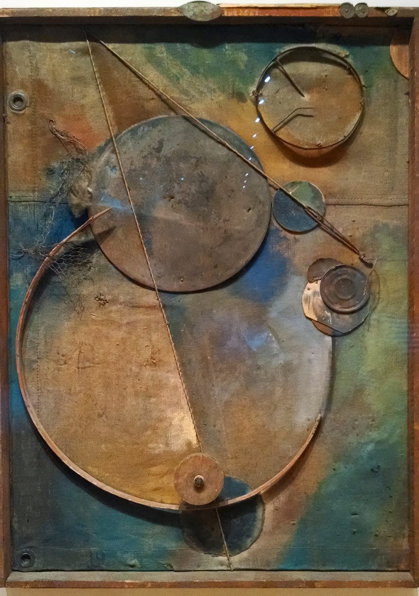
This piece by Schwitter is one of my favorites
Kurt Schwitter

Francis Picabia

Marc Chagall

Gino Severini

Kazimer Malevich

Picasso


LOVE
Georges Braque


 Also rather small.. but it's so nice to know you've seen it in person.
Van Gogh

Frida Kahlo

Frida Kahlo

Picasso


 This is one part of a triptych...  a massive and beautiful display. Each canvas was 6' 6" wide.
Monet

Richard Artschwager

Pigeons anyone?

Back at Grand Central
 All that and a delicious crepe for lunch made for a beautiful and inspiring day!

Monday, September 16, 2013

Another reception this Friday night. Would love to meet you if you're local!


Best... Canace

Wednesday, June 5, 2013

Macro Magic in the Garden

Come walk with me this morning to take a very close look at all the magic happening in the gardens...


Best... Canace

Wednesday, May 29, 2013

Latest Painting - Step by Step

I had no idea when I broke out my paints just exactly what I would paint but I thought this time I would include a person/subject. Below are the steps that ensued.
 First I played around with color, putting some random washes as a background. Then I sketched in the girl with a light wash on her outfit just to give me a feel for the composition. Then I laid in a coat of Golden's Heavy Gel Medium over the outfit making swirls to follow the drape of her skirt and texturizing her top with a piece of vintage lace. I also went outside and picked some Bleeding Heart leaves, painted them white and used them like stamps across the top. On the bottom I added some opaque white flakes for a 'magical meadow' feel.
 I decided I didn't like the white circles (bubbles) so blocked them out with more of the leaf prints. I think Golden's Pyrrole Red is one of the most powerful and beautiful colors so that was my choice for her outfit, just blocking in the color.
 More washes over the top knocking back the white leaf stampings a bit. Here I've also added some shading to her skin and clothes as well as a brilliant bronze metallic paint on the ruffles of her skirt.
 More overall white shapes stenciled in on the top made me think of some pressed Hydrangea blossoms that I'd had for a long time. They were rather brownish so I painted them with a whitewash and laid them across the top to see how I'd like them.
 Here I've glued down the Hydrangea blossoms and added some crimson and blue washes across the top.
 To fill it out and give it a feel of an arbor I've added some green leaves and flowers in green. Lots more definition in her face, body and outfit.
 Here I've painted the flowers white with blue centers and I've added some berries to balance out the color red.
 This is (I think) the finished piece with much more shading/highlighting on her face, hair and body as well as her clothes and a shadow beneath her. A bit more purple to level out the values and of course lots of ferns done with acrylic inks. Of course you can't see the shiny metallic or the textures in the painting but there are many which I think makes it so much more interesting.

Any thoughts on a title?

Best... Canace